Opening at Red Deer

Red Deer Arts Council Newsletter- March 2013_1
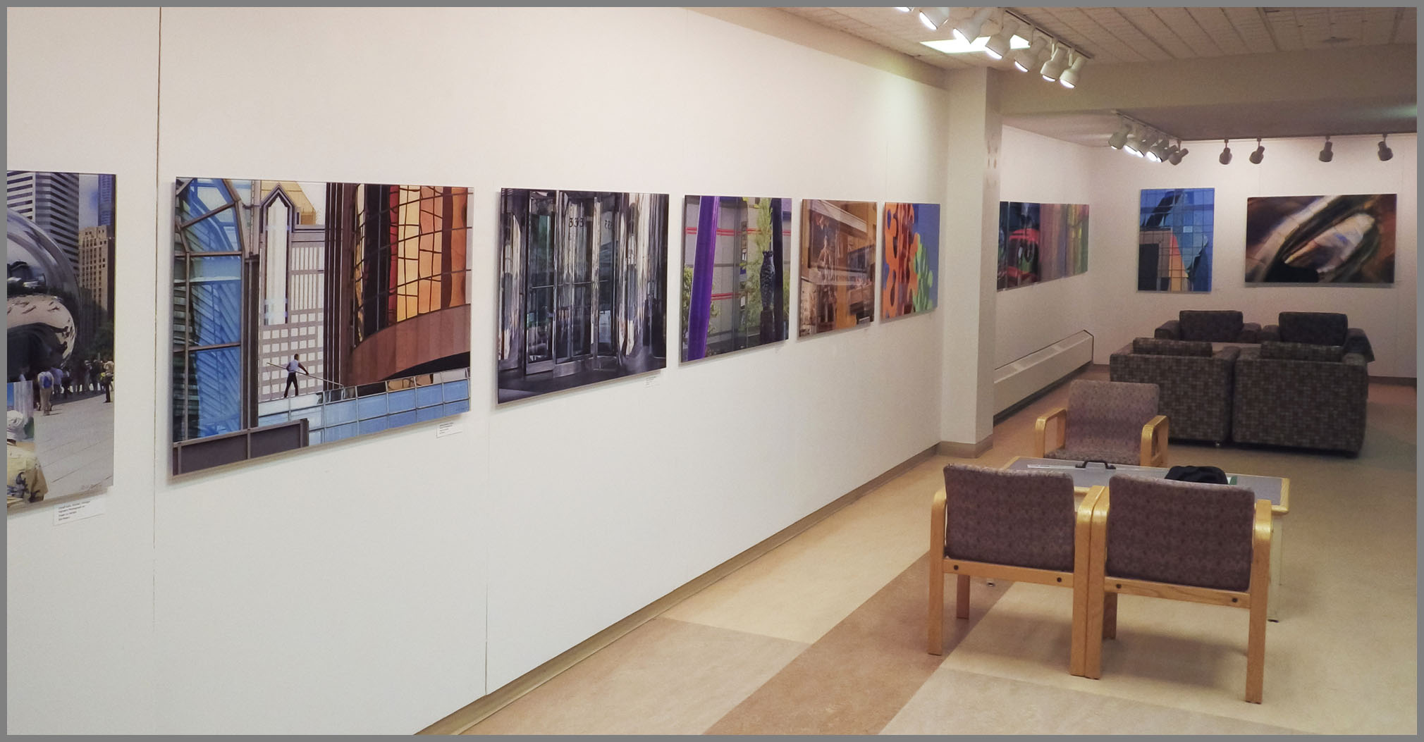
Special thanks to Diana Anderson, who curated my show at the Red Deer Arts Council’s Kiwanis Gallery, along with her team of volunteers who helped us hang the show. Rather than space out the images, Diana chose to crowd them together so they form a powerful band of colour around the room. I love working with curators, like Diana, who know their space. I’ve never worked with a professional curator who has not improved on my initial vision of how a show should go up.
Quintaro Imaging did a splendid job of acrylic mounting the images. I appreciate their sponsorship support as well as sponsorship from The Camera Store in Calgary. I love the clarity and visual simplicity of acrylic mounting – it is the closest thing to having nothing between the image and the viewer that I’ve been able to find – at least that works for these images.
When the City Isn’t looking is on in Red Deer until 2013 April 25.

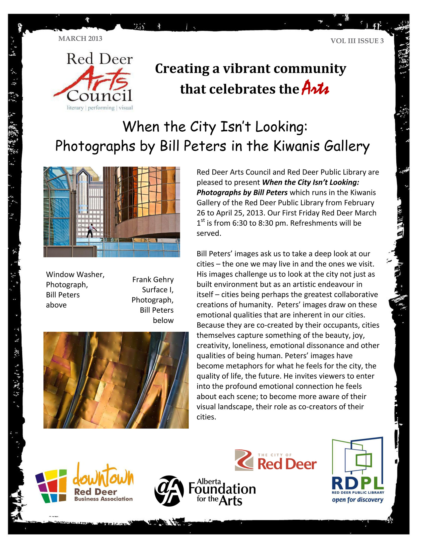
If you visit the show and are trying to find “Frank Gehry Surface #1” – the second image shown in the Red Deer Arts Council’s newsletter, it didn’t make the show. Again a curatorial decision. When we laid out the show in the space – this image, while powerful on its own, was the odd one out and didn’t add strength to the overall show. This is really interesting because when “When the City Isn’t Looking” was first shown at the Gallery of Photographic Arts Canada, in Calgary  “Frank Gehry Surface #1” was the anchor image. What a difference space, visual context and curatorship can make!

IMGP1095Red Deer Installation_3

Jane Doe & Paris

Boydol-Peters Exposure Invitation-1What a great opening! There were over a hundred people at the Resolution Gallery in Calgary last night to launch Jan Boydol’s Jane Doe images and my Paris images. Don’t miss our Meet the Artist’s event on Saturday, March 2 from 2pm to 4pm.
Working on this show with Jan has been such a delight. Her images look amazing on the Resolution’s walls. I appreciate the sensibilities Jan brings to her studies of the female form. The images are expressive, playful and capture the relationship between models and photographer; some revealing a certain intriguing tentativeness on the part of the models, this tentativeness transforming to confident repose in others images. Jan’s photographs convey both femininity and feminism with grace and ease.

The Artist’s Digital Revolution

Stainless Steel Reflections #3, Brooklyn. One panel of Diptych.

Stainless Steel Reflections #3, Brooklyn. One panel of Diptych.

Craig Richards and I were talking at the Whyte Museum of the Canadian Rockies about the revolution in color print permanence since the year 2000. (See “Will it Last?”) Our conversation led me to appreciate the range of new digital tools that  enable photographic artists to have a more dramatic and yet finer set of controls over the image than ever before.

This isn’t about camera features. I’m interested in what the photographic art world calls the “controls” – metaphorically the palette of levers I can pull to create an intended artistic result.

Here are my top ten: Read the rest of this entry »

Will It Last?

Part One – The Image

Warhol’s Marilyn, Pisoletto’s mirror, Visitors, MOMA, New York.  Pigment Print 20x30 in.

Warhol’s Marilyn, Pisoletto’s mirror, Visitors, MOMA, New York. Pigment Print 20x30 in.

Art buyers, aware I print digitally, have asked me, “Will this image last?” This question is almost never asked of painters, watercolourists, mixed media artists or sculptors, only of photographers. The question of, “ Just how permanent is this?” has been with photographers ever since 1839 when John Herschel developed the first chemical “fixer” to halt the exposure and development of silver salts coated on paper, leaving a long-lasting image.

Some images from photography’s earliest decades remain in pristine condition, proving that photographs can be permanent. However, throughout the history of photography there have been instances where certain types of images have faded or degraded almost before our eyes. These instances include the instability of black and white prints on resin coated paper, the rapid fading of early C-prints and the fleeting nature of inkjet images produced with first generation printers that used dye inks rather than the more permanent pigment inks. Thus art buyers are justly wary when purchasing a photograph. Due to these past issues, photography’s image permanence has been the subject of more intense scientific scrutiny than any other medium. As a result, ironically, we have more data about the longevity of photographic materials than for any other media. Read the rest of this entry »

What’s wrong with this picture?

Some viewers of my images from South San Francisco Bay have assumed the strong colours are water pollution. When these viewers discovered that wasn’t the case, I sensed some disappointment. Perhaps their assumption was conditioned by Ed Burtynsky’s images presented by the Whyte Museum in 2009, where one especially iconic image showed water colourfully stained by nickel mining residues.
The colors in my SF Bay images are the result of microorganisms, brine shrimp for the yellows, oranges, reds and magentas and algae for the greens and some yellows. The brine shrimp change colour depending upon the salinity of the water in the salt sloughs and evaporation ponds. When the water completely evaporates, the shrimp dry out and lose their colour. (Hmmm – do we get a helping of dried brine shrimp when we consume sea salt?)

Rather than pollution, the Bay images are coloured by billions of apparently happy, thriving brine shrimp plus algae. So what’s wrong with this picture? Read the rest of this entry »

When Water Dreams

I’m delighted to invite you to the Willock & Sax Gallery in Banff for the opening of When Water Dreams. The opening event is from 2 to 4 pm on Saturday, February 6, 2010. I’m honoured to share it with Robert Sandford, who is introducing his important book called Restoring the Flow, Confronting the World’s Water Woes.

This is a great opportunity to make a winter visit to Banff, either for the afternoon or for a day or two. Willock & Sax Gallery has special discount arrangements with Juniper Hotel and Bistro and Bow View Lodge. Follow this link to book a room and take advantage of the savings: http://www.willockandsaxgallery.com/banff.htm

This show opening and book launch is part of EXPOSURE – the Calgary, Banff, Canmore Photography Festival.

48170-peters-sandford-invites-3-2s

48170-peters-sandford-invites-3-1s

Willock & Sax Gallery

wsjuly07c1

How do you purchase one of my images? It’s easy. You simply dial 1 866 859 2220 and ask for Susan.

Susan Sax-Willock and Thomas Willock are the founders and owners of the Willock and Sax Gallery and they are my representatives. First opened in Waterton and now located in Banff, Alberta, their gallery is dedicated to their vision of presenting the work of a very high quality cross section of Canadian fine artists. Susan brings a background as an artist, arts scholar and arts administrator. Tom is a zoologist with an intense feeling for the earth and environment, the former Director of a major museum and a delightfully talented interpreter of the western landscape with his black and white silver prints; the ones centre-left in the image above. In my own collection I have Tom’s “Lenticular Clouds: Red Rock Canyon Road, Waterton Lakes National Park, 1983,” an image I find particularly moving.

If you travel to Banff from time to time, be sure to check the Willock & Sax website for events at the Gallery and Banff activities. Better yet, ask Susan to put you on their e-mail list. Just call her at the number above or  click here.

“When the City” Featured in Camera Store Newsletter

window-washer-calgary-c-bill-peters
This months newsletter from The Camera Store features a number of my images and talks a bit about my working tools and methods. If you haven’t subscribed to The Camera Store’s Newsletter yet – click here.

Does Art Have Laws?

psychology-today-cover-clip0041

Jonah  Lehrer writes a fascinating article in the July, 2009 Psychology Today about what we are leaning about human vision and about how our brain interprets that information. Unfortunately the Psychology Today headline writer calls the ideas that Lehrer teases out “laws” on the cover. This butchers the scientific meaning of “law” and is a LOUSY thing to do. Nowhere in Lehrer’s article, titled “Unlocking the Mysteries of the Artistic Mind,” does he talk about “laws”. Instead he identifies ten perceptual principles of great art. Here are a couple of them; you will have to buy the magazine to get the rest:

“BALANCE: Successful art makes use of its entire representational space, and spreads its information across the entire canvas.

ISOLATION: Sometimes less in more. By reducing reality to its most essential features – think a Matisse that is all bright color and sharp silhouettes – artists amplify the sensory signals we normally search for.”

Will understanding the principles lead directly to you or I making great art? That is a LOUSY idea, something Lehrer acknowledges when he quotes V. S. Ramachandran, the UC San Diego scientist who had done many of the studies that form the basis of his article as saying, “Anybody can learn these visual rules, but you still need talent and training in order to turn them in to fine art.”

psych-today-aug-09-cover11Is knowing the rules a good idea? Sure. Knowing these and much more equips the artist, and the art critic, with a more capable tool kit. Still knowing the rules only gets one so far. It’s the difference between knowing the notes on the piano and being able to make great music. As I write this I think of all those who have struggled to learn the zone system only to wind up with a closet full of technically perfect but emotionally dead negatives.

Whats more, the rules of art are mainly derived a posteriori. That is we or society first identifies a work as great art, then we go seeking information on why we respond to say, the Mona Lisa, the way we do. They give us no information on how to set out to make great art.

Art is fundamentally an emotional quest. Ramachandran, with his brain imaging, reveals a neuroasethetic and gives some glimpses of why art works. The question remains open, “What drives some of us to make emotionally expressive art?”

BTW – Art is the product of our decisions. In this context I’m enjoying reading Lehrer’s recent book, “How We Decide.”

David Campion and Sandra Shields


campion-11

I get excited when I see something in an entirely new way. I get almost as excited (and a little envious) when someone shows me something through new eyes – when they grab my viewpoint and shift it.

After reading David Campion’s text and reading Sandra Shields’ words, I’ll never look at the Calgary Stampede the same way again. Sandra’s article and David’s images, titled Cowboy Wild in the July 2009 issue of SWERVE Magazine combine to create an amazing piece of cultural anthropology – dissecting the mythic cowboy and the reality behind the legends that fuel Calgary’s annual festival. Unfortunately the web link to SWERVE only takes you to Shield’s text. For the images you’ll have to visit davidcampion.ca. Happily Shields’ words can stand entirely on their own as can Campion’s images. Together they have a chemistry where one plus one equals more than two.The images of Cowboy Wild were the subject of a major exhibition at the Art Gallery of Calgary during the fall and winter of 2008. Seeing the SWERVE article I was pleased by how well David’s images held up on the thin newsprint pages – even after seeing them at 20″x30″ in the exhibition.

SWERVE’s Editor-in-Chief, Shelley Youngblut, has taken a typical “what’s-on-in-town” newspaper supplement and injected a series of telling and reflective articles that sit at the junction among finely crafted literature, social commentary, fine art photography and documentary photography. In an age when thoughtful publications seem to be rarer and rarer – especially coming from a popular newspaper press, to see where Youngblut is taking SWERVE is an encouraging delight. It is worth picking up the Friday Calgary Herald just to get SWERVE – though this summer only July and August issues are being produced.

campion-21

Both Sandra and David have an ease about them that makes everyone around them comfortable. This is so evident in the photography and the writing. David’s images speak with great force – at the same time they are not forced. The same can be said of Sandra’s words, words that speak with a truth and essence of people places and events that perfectly compliment David’s images. They make us look and think about familiar things in new ways and compell us to open our eyes to parts of society that, perhaps subconsciously, we didn’t want to see. More about Sandra Shields’ writing and the Shields/Campion collaboration is at fieldnotes.ca.